
KeelsonE-commerce website for a kayak brand
A responsive product and ordering experience for configurable kayaks, from feature exploration to checkout
 GermanyCountry
Keelson is a kayak brand with models that adapt to different activities through adjustable seating, practical storage and configurable equipment. Xmethod designed and developed a responsive product website that turns detailed construction and specification data into a clear shopping journey, from discovering a model to choosing options and submitting an order.
What we did
Tasks
- 1Turn detailed kayak information into a clear product journey
- 2Explain construction, comfort, storage and durability visually
- 3Present dimensions and load capacity in an accessible format
- 4Design configuration, cart, callback and order flows
- 5Adapt product discovery and ordering for mobile screens
- 6Implement and test the responsive experience in Webflow
The project at a glance
Challenge
Kayaks are technical products: visitors need to understand construction, dimensions, seating and storage before they can confidently choose a model. That information also had to remain easy to use on a phone.
Solution
We mapped the complete buying journey, designed a visual product system in Figma and built it in Webflow with responsive model pages, feature explanations, specifications, configuration, cart and order forms.
Result
Product discovery and ordering now belong to one consistent experience. Visitors can compare what matters, configure the kayak and move to an order without leaving the visual language of the brand.
2
responsive contexts: desktop and mobile
4
configuration choices: model, colour, seating and quantity
3
conversion paths: cart, request details and callback
1
connected journey from product discovery to order
A technical kayak catalogue built for confident decisions
Keelson models combine adjustable seating, luggage compartments and configurations for different situations on the water. The website therefore had to do more than display attractive product photos. It needed to explain how the kayak is built, which model fits a particular use and what can be changed before ordering.
Make product detail feel like a guided shopping experience
The goal was to make dense technical information easy to scan without losing the detail that matters to experienced buyers. Visitors should be able to move naturally from the model overview to features, specifications and configuration, while the same journey remains comfortable on mobile through to delivery details.
Technical complexity
Dimensions, capacity, construction and equipment had to be understandable without turning the page into a specification sheet.
Configurable products
Colour, seating, quantity and additional equipment needed one coherent selection flow before the cart.
Mobile ordering
Long product pages and order forms had to stay clear and actionable on narrow screens.
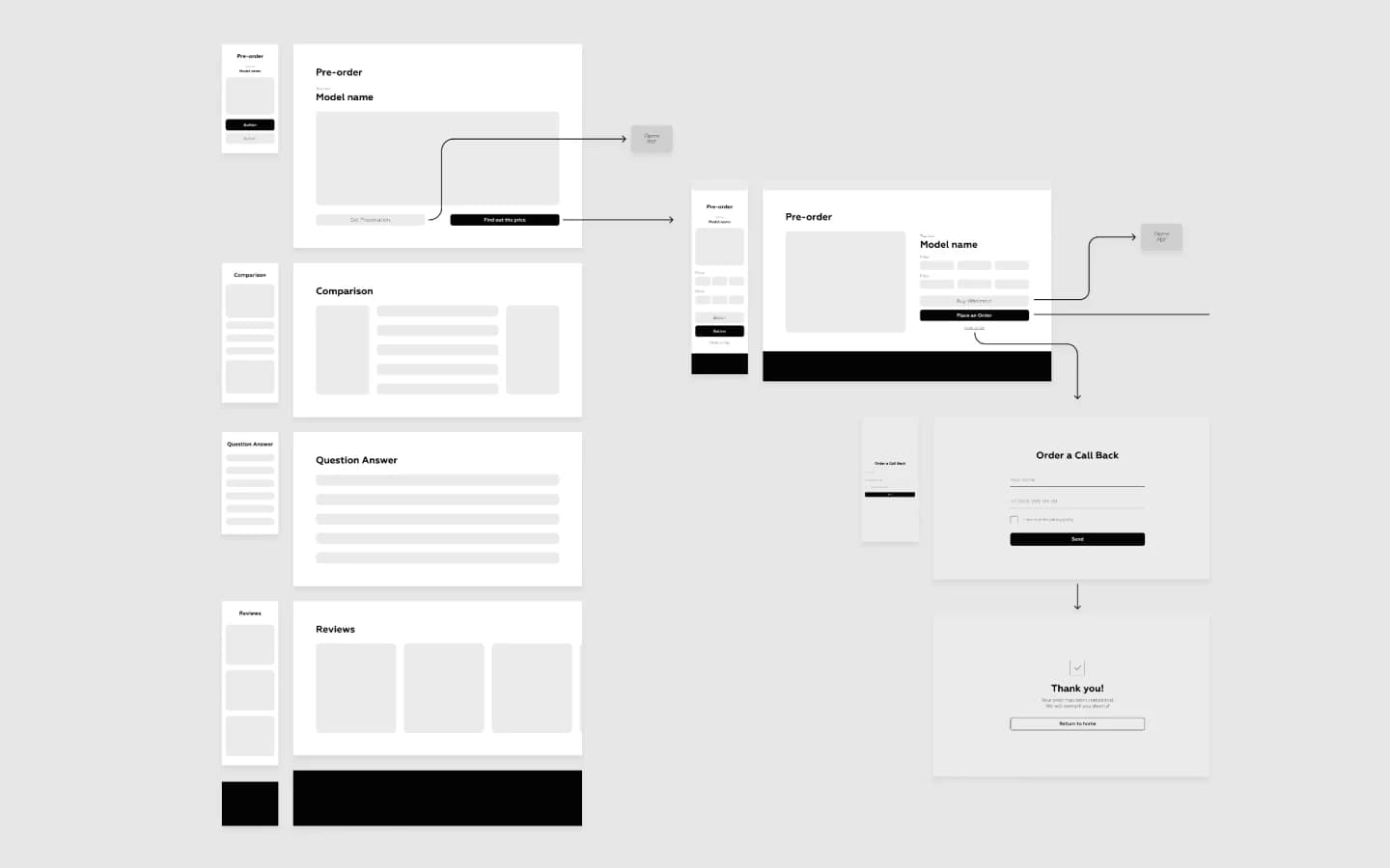
The complete journey was mapped before visual design
Desktop and mobile wireframes established the path from pre-order and comparison pages to the cart, callback request and order confirmation. Giving every action a place early made it possible to design product information and conversion steps as one system instead of a collection of separate pages.
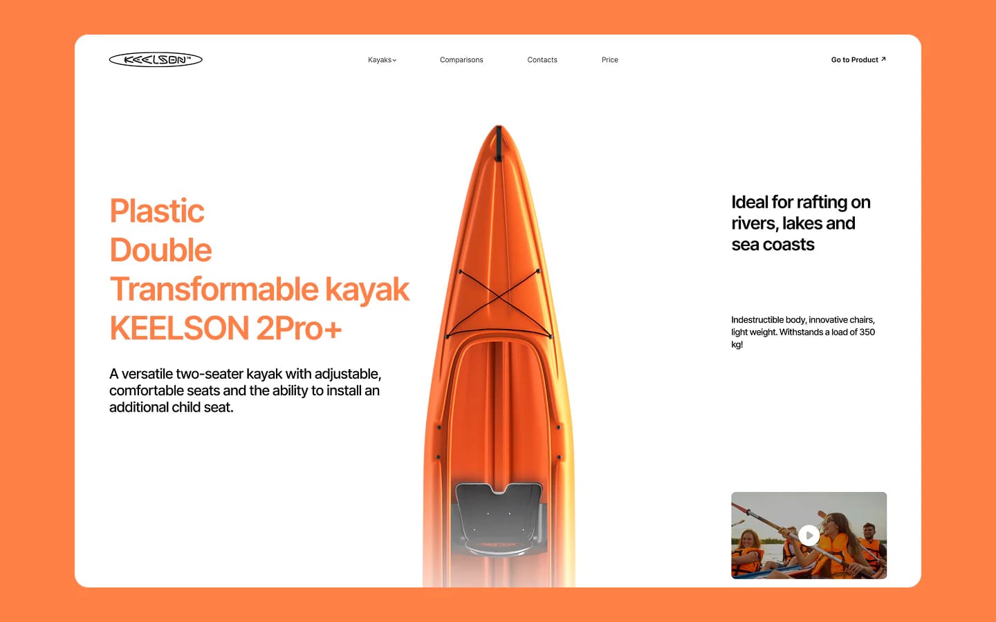
Orange accents turn the kayak into the interface anchor
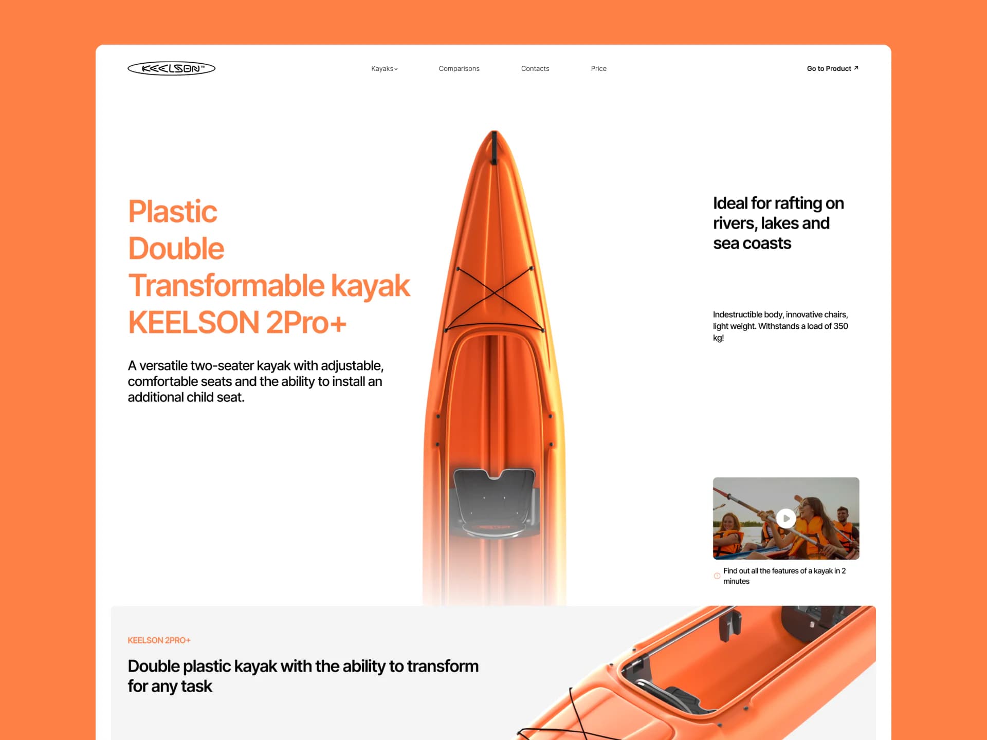
The Figma design pairs bright orange with white surfaces, bold type and large product photography. The kayak stays central while navigation and calls to action remain restrained. Modular content blocks separate features from specifications and keep a long technical page easy to scan.
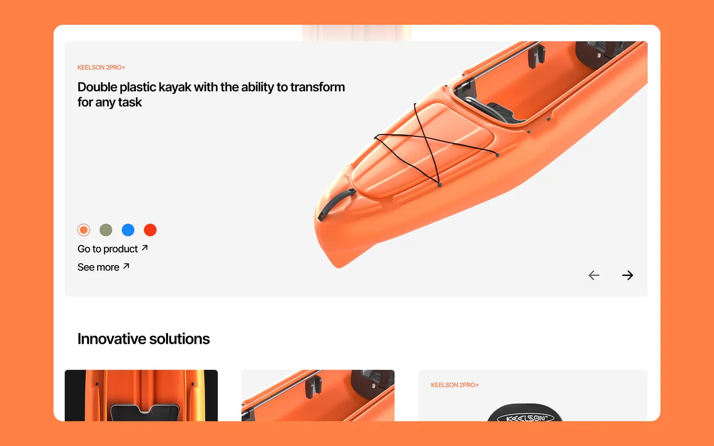
Large visuals lead into model details
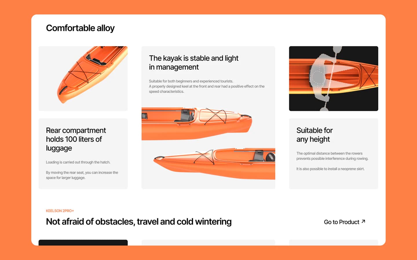
A model opens with a large kayak image, colour choices and direct routes to its full page. Feature cards then connect close-up photography with the relevant component, so visitors understand adjustable seating, footrests and other practical details before entering the configurator.
Practical benefits are tied to visible parts of the kayak
Handling, seating space and luggage storage are explained through product angles and short descriptions. The layout shows where each benefit comes from: hull shape, seat position and the rear compartment. This makes comfort and capacity easier to assess than a generic list of selling points.
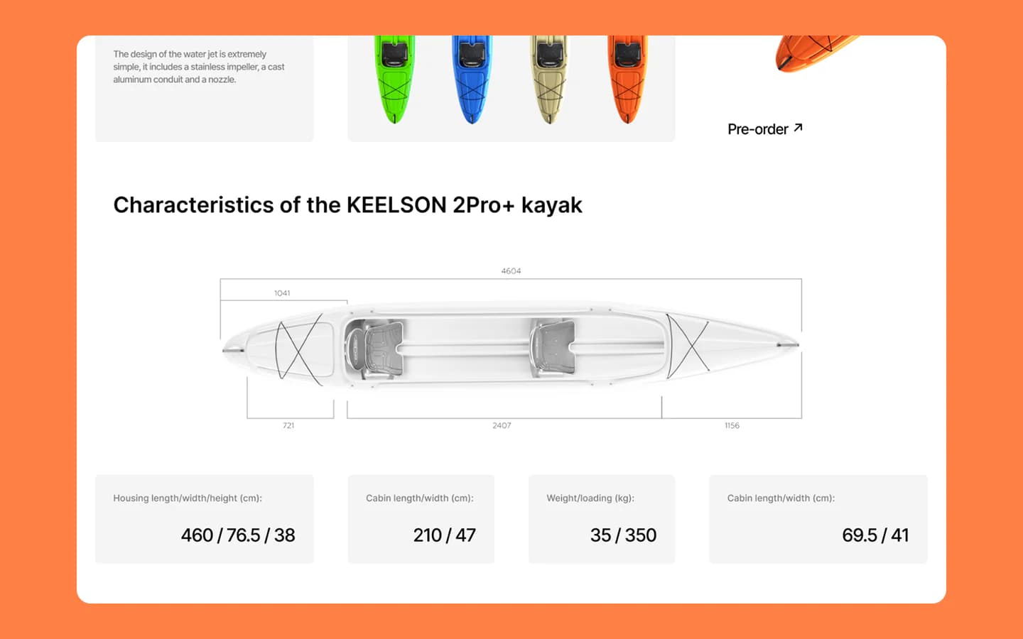
Dimensions and load capacity become part of the visual story
A dedicated specification block pairs a dimension diagram with the measurements, cabin size, weight and load capacity needed to evaluate the product. The diagram gives visitors spatial context while the cards below provide exact values for comparison.
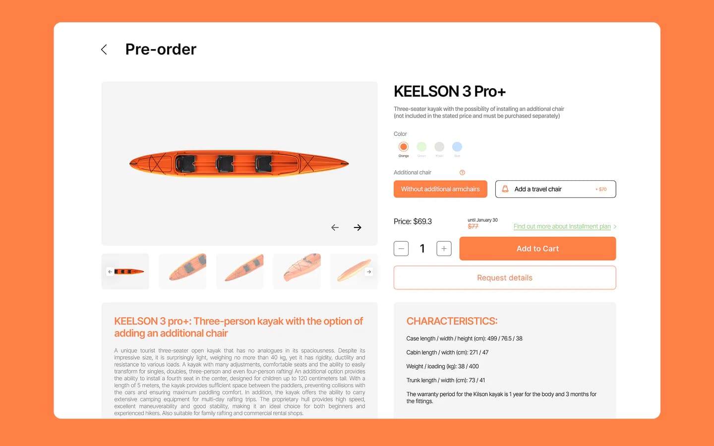
Options, pricing and product details share one interface
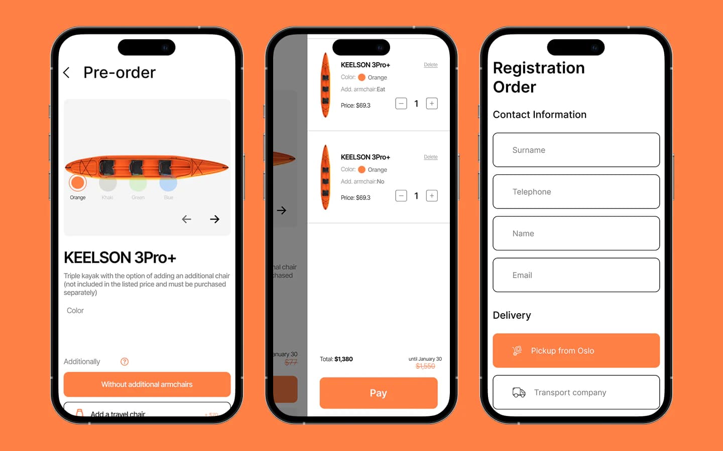
The pre-order page combines the gallery, colour selection, seating options, quantity and pricing. Visitors can review the chosen model and its characteristics, add equipment and continue to the cart. A request-details action also supports customers who want to speak with the company first.
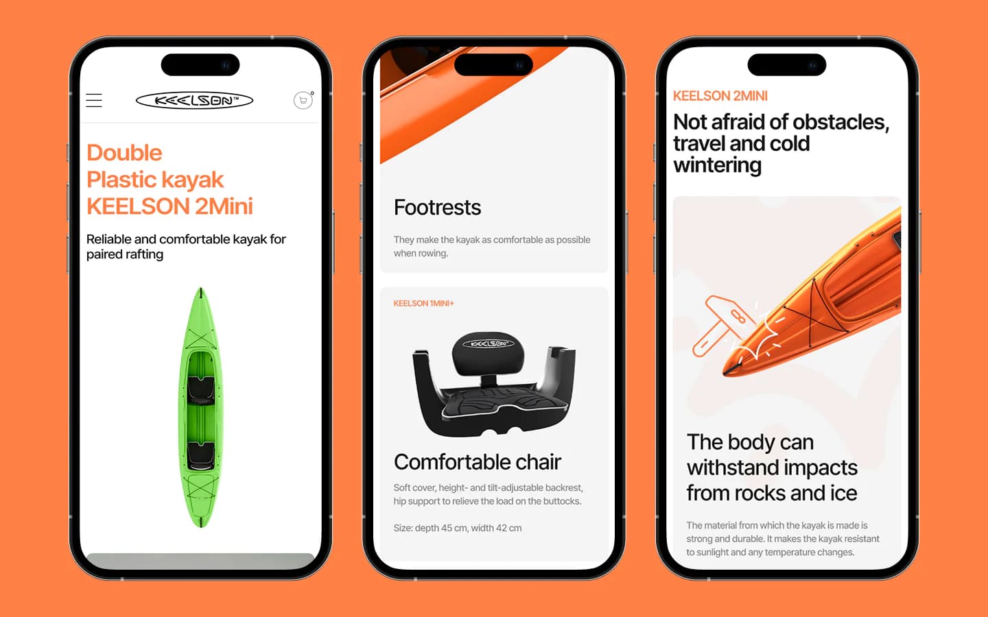
The same product hierarchy works on smaller screens
On mobile, model introductions, component cards and durability explanations become a clear vertical sequence. Large images remain prominent, while typography and spacing preserve the distinction between overview, feature and evidence without relying on a desktop-sized canvas.
Configuration, cart and delivery stay connected
The mobile flow keeps colour and equipment controls close to the product image, then carries the selected configuration into a compact cart. The order form collects contact details and presents pickup or transport delivery as clear choices, preserving context through the final step.
The Figma system was translated into responsive Webflow pages
Development covered navigation, catalogue and product presentation, configuration controls, cart and forms. Testing focused on layout behaviour across screen sizes, interaction states and the transition between each shopping step. Image scaling, spacing and content flow were refined so the product remains the focus on desktop and mobile.
The implementation and review covered:
- Responsive behaviour of long product and specification pages
- Colour, seating, quantity and equipment controls
- Cart updates and continuity of the selected configuration
- Callback, contact and delivery form states
- Image scaling and content hierarchy across desktop and mobile
One consistent path from product story to order
The finished Webflow website connects Keelson's product presentation with a structured ordering experience. Visitors can explore the kayaks visually, understand their construction and specifications, choose a configuration and proceed to an order without switching to a disconnected sales flow.
More projects
 FinTech
Fundora
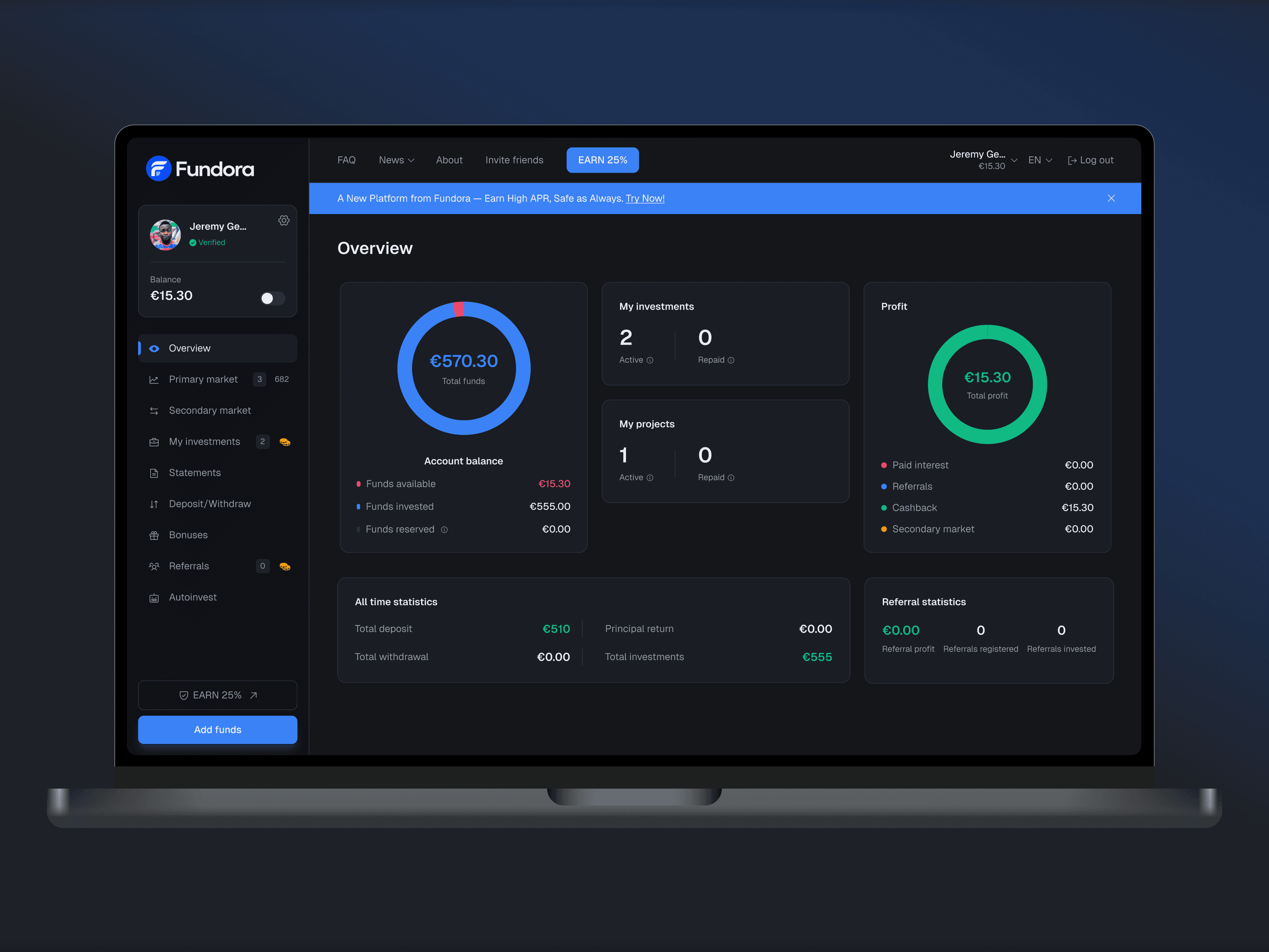
Web investment platform: balance, investments and returns in one dashboard, plus a primary and secondary market, deposits and withdrawals.
 Agency Operations
CPD
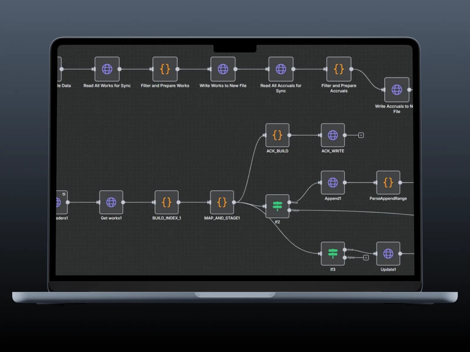
ERP system for agency work records, contributor payouts and project finance.
 Sport
SportSportsForce
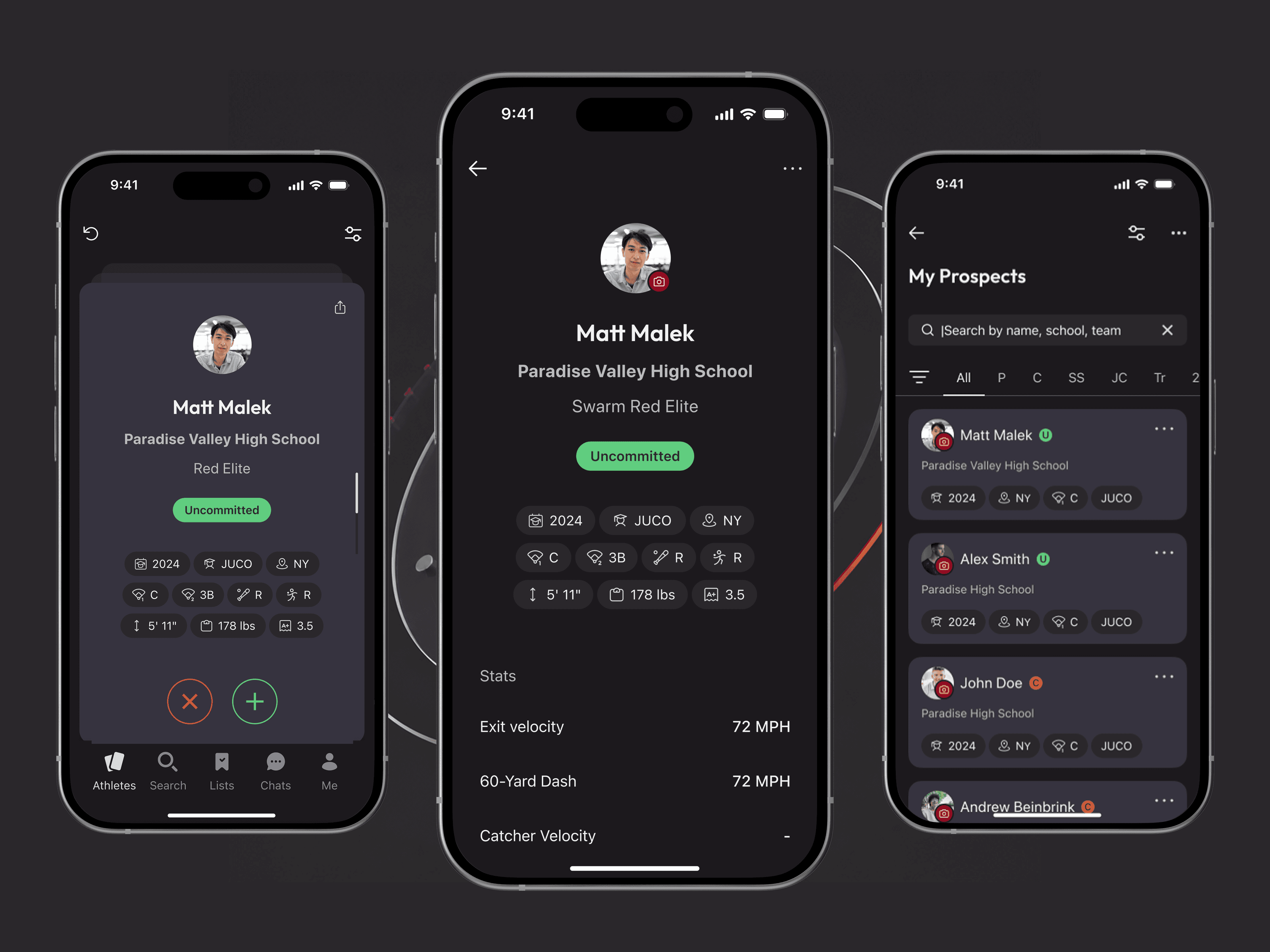
Mobile Tinder for sports recruiting: a FlutterFlow app with custom swipe widget, matching, ranking and Supabase backend.
Let’s discuss your project
Free and non-binding — book a slot straight away or drop us a message.

Dennis Polevik
CEO
Free intro call with Xmethod
- Free, no obligationNo obligation and no cost
- Straight with the teamStraight with the team, no sales reps in between
- A concrete next stepYou leave with a concrete next step
Dennis Polevik
CEO
Let's discuss your project
What happens next?
- Reply within 1 business dayWe review your project and get back to you within 1 business day
- Short call on your goalsWe hop on a short call to align on scope and goals
- Clear proposal, no obligationYou get a clear proposal — no obligation, no pressure