2do.liveLocal activity discovery and community platform
Discover nearby places and activities, share experiences and publish offers across mobile and web
 GermanyCountry
2do.live is a platform for discovering local activities, places and offers through an interactive map and a community feed. Users can explore content based on their interests, check practical details, share reviews and publish their own offers. Xmethod developed the mobile and web experiences from the client's existing designs and connected the key journeys into one product.
What we did
Tasks
- 1Connect map exploration with a recommendation feed
- 2Implement interests, date, price, distance and author filters
- 3Build reviews, comments and image uploads
- 4Create offer publishing, editing and deletion flows
- 5Keep user profiles and saved content consistent across platforms
- 6Test forms, filters, navigation and responsive layouts
The project at a glance
Challenge
Maps, recommendations, reviews, offers and personal accounts had to work as one discovery journey instead of separate product areas.
Solution
Flutter and Next.js experiences connect map-based exploration, interest and date filters, community content and offer management with Supabase behind the shared data flows.
Result
Users can move from discovering a nearby activity to checking its details, contributing feedback and managing their own publications on mobile or web.
2
connected product surfaces: mobile and web
4
discovery tools: map, feed, interests and filters
3
community actions: offers, reviews and comments
1
shared journey from discovery to publishing
Local discovery shaped by people and interests
2do.live brings two ways of finding something to do into one product. The map answers what is nearby, while the feed shows what the community recommends. Interests, practical filters and detailed activity pages help users move from browsing to a concrete plan without losing the geographic context.
Turn supplied designs into one working mobile and web platform
The client provided the visual designs. Our task was to implement the product journeys behind them: maps and heatmaps, search and filters, reviews and comments, offer publishing and personal account management. The same product logic had to remain understandable across compact mobile screens and wider web layouts.
Location and content
Geographic discovery and community recommendations needed to reinforce each other rather than compete for attention.
Flexible publishing
Offers and reviews combine images, interests, dates, places and optional details in forms that must still feel manageable.
Cross-platform consistency
Mobile and web use different layouts, but filters, content and account actions must follow the same rules.
Discovery and contribution in a compact flow
A map, feed and detail page form one discovery loop
Map markers and heatmap areas give users a geographic overview. The feed turns nearby content into recommendation cards with imagery, ratings, prices and addresses. Opening an activity keeps its date, host, language and location together so the next decision has the context it needs.
Interests and filters narrow discovery without hiding context
Users can choose interests across leisure, food and travel, then filter results by date, price, distance or author. A dedicated calendar supports a single date or a range. These controls turn a broad local map into results that match both preference and practical availability.
Reviews and comments keep recommendations accountable
The review flow combines a place, interest, star rating, written feedback and optional photos. Comments support discussion around a publication without separating it from the original content. Offer cards continue to show the essential image, price, location and rating while users read or contribute feedback.
Offer creation grows from a short form into useful detail
Users start with images, an interest, date and location. Additional sections add a description, price, co-hosts, language, repetition and anonymous posting without forcing every field into the first view. The form can stay quick for a simple offer and expand when the activity needs more explanation.
Profiles connect discovery with offer management
The profile gives users access to interests, saved content, messages, settings and private data. A dedicated list collects their published offers, and the editing view brings the same practical fields back into one place. Users can update images and details, save changes or remove an entry.
The same journeys use the room of a wider screen
The map stays central while interests open in context
The web interface keeps search, interests, filters and view switching in the top navigation. Users can move between map and feed or begin adding content. Interest selection opens over the map, so categories can be adjusted without losing the area and results already under review.
Experience details balance imagery and practical information
The detail page uses the wider layout for a large image gallery, title, location, map, rating and date. Save, share and engagement actions sit alongside the content. Users can assess the visual impression and the practical conditions together instead of moving between separate views.
Feed and review tools keep the subject visible
The web feed combines offer cards with navigation, publishing actions and recommended profiles. On the review page, the selected offer remains visible beside the feedback fields for text, rating, location, interests and images. This reduces uncertainty about what is being reviewed while the form is completed.
Designs became connected product behaviour
Implementation covered navigation, maps, filters, form behaviour, image uploads and the full lifecycle of an offer from creation through editing and deletion. Testing followed the same user journeys across mobile and web, with special attention to validation, saved changes, filter results and responsive layout behaviour.
The implementation and review included:
- Map interaction, heatmap presentation and transitions into detail pages
- Interest, date, price, distance and author filtering
- Review, comment and image-upload states
- Offer creation, editing, saving and deletion
- Navigation and layout consistency across mobile and web
One platform for finding and sharing local experiences
The supplied designs now work as a connected Flutter and Next.js product. Users can discover local content through maps, feeds and interests, inspect practical details, contribute reviews and comments, and manage their own offers. Mobile and web support the same product model while using the strengths of each screen size.
More projects
 Lifestyle
Nearby Spots
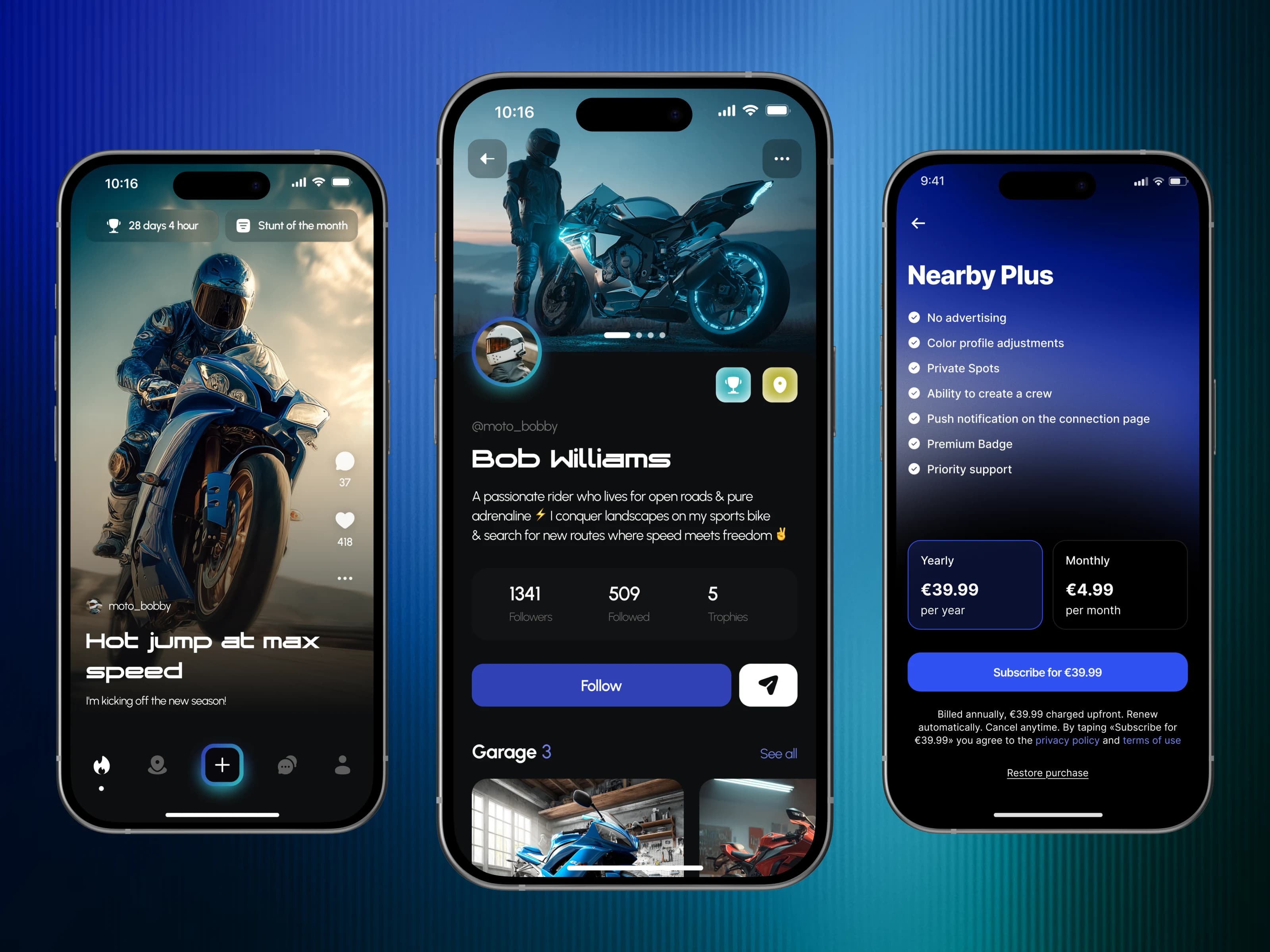
Motorcycle community app with rider profiles, personal garages, shared content, push notifications and RevenueCat subscriptions.
 Social
Kissmet
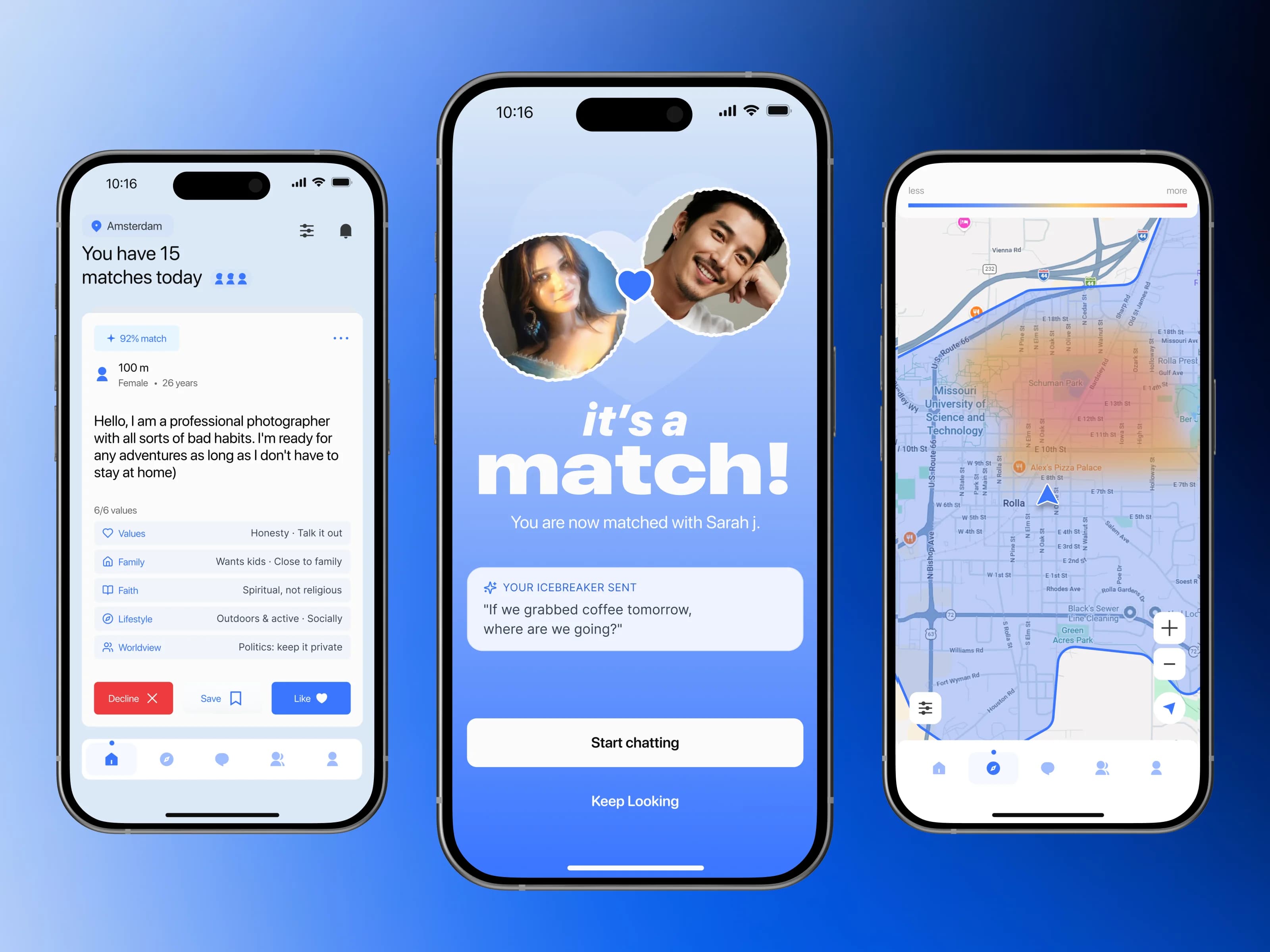
Local dating app with values-based matching, requests, chat and a Next.js waitlist landing page.
 Healthcare
Empathia
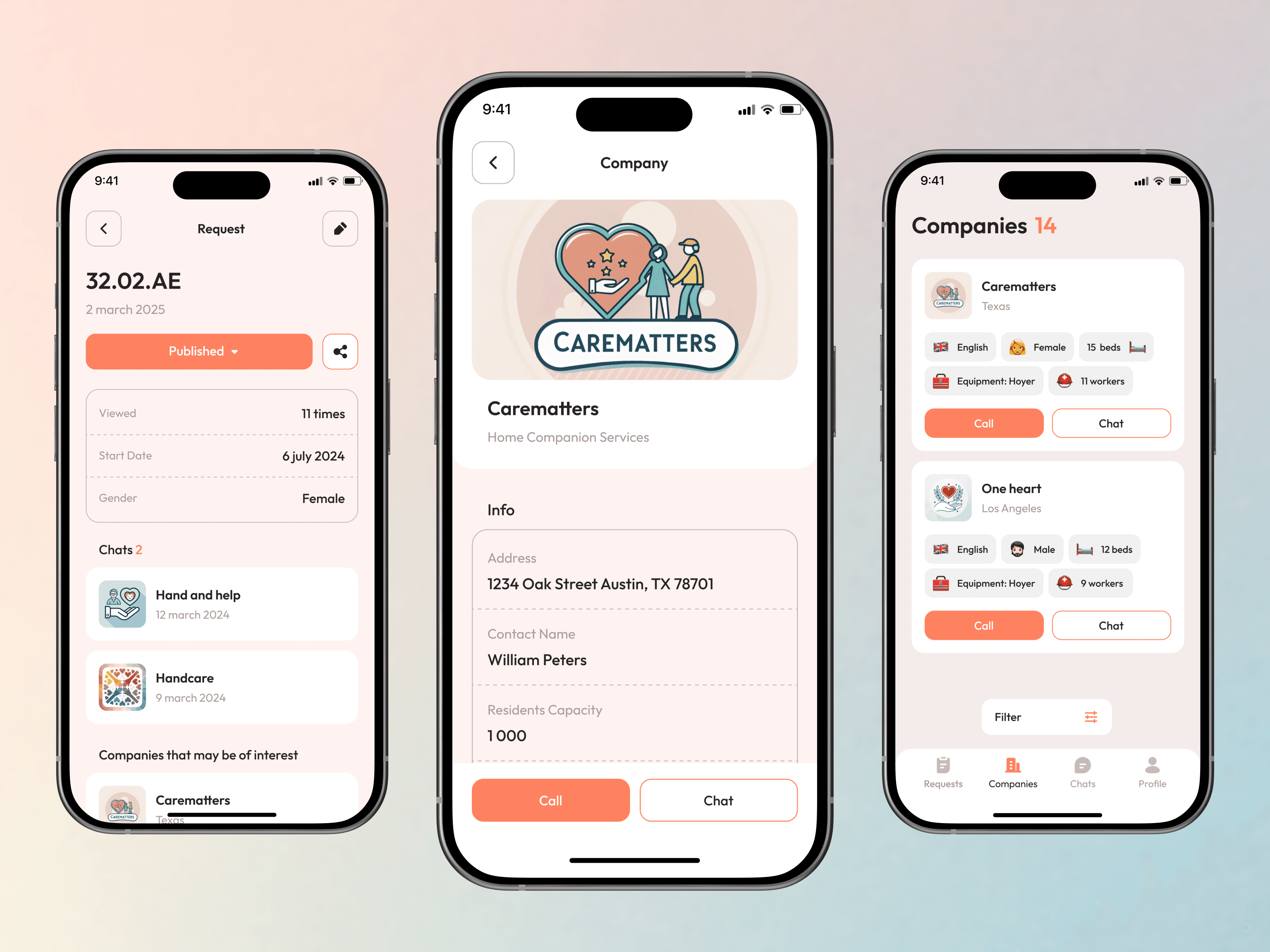
Mobile caregiving platform for care requests, jobs, company and caregiver profiles, training and direct communication.
Let’s discuss your project
Free and non-binding — book a slot straight away or drop us a message.

Dennis Polevik
CEO
Let's discuss your project
- Reply within 1 business dayWe review your project and get back to you within 1 business day, no sales reps in between
- Short call on your goalsWe hop on a short call to align on scope and goals
- Clear proposal, no obligationYou get a clear proposal — no obligation, no pressure